Hacker News Comments on
Music Software & Bad Interface Design: Avid’s Sibelius
Tantacrul
·
Youtube
·
112
HN points
·
12
HN comments
- This course is unranked · view top recommended courses
Hacker News Stories and Comments
All the comments and stories posted to Hacker News that reference this video.We are very, very far away from that. To get a feel of what scorewriter software is like nowadays, Tantacrul's videos[0] on the subject of UI are very good at showing what the state of the art is. On one of his videos he shows that the best score engraving can only be achieved by using a closed source, now-unsupported command line program from the 80s called Score[1][0] https://www.youtube.com/watch?v=dKx1wnXClcI [1] https://en.wikipedia.org/wiki/SCORE_(software)
A good rundown of the history of Sibelius, Avid and Dorico is included in this video: https://youtu.be/dKx1wnXClcI
> doing things like automating certain workflows where possible, building some custom tools, etc. The goal is to slowly transition to working as a programmer at Steinberg or Ableton or something like that, and then start my own company.I presume you’ve contacted tantacrul[1] who is now working[2] redesigning Audacity, with a hilarious video on the hellscape of a UI that is Sibelius[3]. I am guessing becoming a UI designer for a major piece of software is less difficult than becoming a composer?
[1] https://www.youtube.com/user/martinthekearykid
[2] https://www.youtube.com/watch?v=RMWNvwLiXIQ
[3] https://youtu.be/dKx1wnXClcI
Thank you for your story - it is a good reminder of the risks we face.
⬐ rewgsI haven't contacted him but I love his work!!
Since Sibelius and Finale are two industry-leading (and very much competing) music notation software systems, this headline made me do a quadruple-take!For those interested in (extremely entertaining) breakdowns of the Sibelius software and other offerings in this space from a UI/UX design perspective, I highly recommend Tantacrul's videos, which propelled him to becoming the head designer for MuseScore and Audacity. IMO, this and his Dorico video are must-watch crash-courses for any developer touching UX design, even outside of music! https://www.youtube.com/watch?v=dKx1wnXClcI
OSS needs more UI/UX people, and I think Tantacrul is fantastic for this.His twitter (https://twitter.com/Tantacrul) and youtube (https://www.youtube.com/user/martinthekearykid) are full of interesting tidbits, an you can tell he's passionate about things.
Even if you don't do music/notation his video on Sibelius, https://www.youtube.com/watch?v=dKx1wnXClcI , is ridiculously funny, but also on point.
⬐ mxcrossbIMO the problem is that OSS developers hate any change that’s made to a UI because it breaks their workflow. As a result, a lot of OSS has old style interfaces, and it’s hard for UI designers to convince the others to make changes.⬐ open-source-ux⬐ goodmachineRelated is this: sometimes you have been using a piece of software for such a long time you can no longer judge whether the user-interface (UI) is any good. You've simply mastered the steps (and keyboard shortcuts) needed to accomplish a task and it now feels "natural", no matter how clunky or clumsy the steps remain.And there's also a widespread belief among developers that making a task easier in the UI means "dumbing down" the UI. Or that making software easier to use means it could never satisfy "power users".
Developers love to revel in arcane interface minutiae (especially for command-line tools). They think it's equal to acquiring a skill or knowledge. But it's not really. Instead, it is the perpetration of a clumsy method to completing a task. But now that the developer has mastered that method (and that feeling of "knowledge" gained as a consequence), they won't easily let go. Or be easily persuaded of a different method.
⬐ frosted-flakes⬐ bayindirhA good example is the UI of Adobe Photoshop/Illustrator/InDesign, which is not at all intuitive. I was incredibly confused when I first started using them, and it took me a long time to become proficient. But now I've mastered them, the absolute last thing I want is for them to do a UI overhaul.⬐ nitrogenInstead, it is the perpetration of a clumsy method to completing a task.Not in every case. For experienced/professional/power users of any software, what matters is maximizing the information density in time of both input and output. Sometimes the best way to do that appears arcane.
I want to be able to accomplish much in as little time as possible, so I want a high temporal input information density. So that might mean using a mouse instead of a trackpad for precise aiming and scrolling, or using keyboard shortcuts instead of on-screen icons. It might mean there are different mouse behaviors for ctrl-drag, middle-click-drag, etc.
I also want to be able to receive as much information about the state of the application as possible in as little time as possible. Too little density and I have to keep more state in my head and spend time jumping around. Too much density and the senses are overwhelmed. This might mean, for a CLI tool, that zero output is the best output in case of success. But for long-running processes that might be a progress bar under a list of log entries. For GUIs, the optimum might mean that there is a lot of information and a lot of actions on screen with reduced whitespace, which seems intimidating at first but is necessary to communicate the state of the system to the user.
So convincing any power user to "let go" is like asking someone to give up their legs for a scooter. Sure, it's simpler to go places in mostly straight lines with a scooter, but linear motion is only one of the many things people do with their legs that justify the arcane UI of unstable bipedal locomotion. We walk along streets, run along trails, jump over obstacles, dance, spar, climb, swim, etc.
This is not to say that scooters have no place, or that every tool is at a global optimum. But any "different method" that someone wants to propose will very deservedly receive pushback if it does not fulfill the full purpose of the old method.
I do not hate when an application I use revamp its UI (e.g. Pixelmator -> Pixelmator Pro). However, developing good UX is as hard as developing robust code and high performance algorithms.Unless the devs get UX improvement backwards (cough GNOME cough), there's nothing to worry IMHO. OTOH, for a CLI application, backwards compatibility and/or graceful depreciation is key.
⬐ redwall_hpModern "UX" is just a failed premise. It favors hand holding for the novice, which someone won't remain forever, over efficiency and control for the experienced user."Old style" interfaces are universally better than tabletized crap, and had as much and higher quality research into the choices behind them. It's not limited to OSS. Apple is a glaring example of that right now. The Mac Human Interface Guidelines and the thought that went into the Mac OS were phenomenal. Contemporary style changes driven by users' familiarity with tabletized (or dare I say "Fischer-Price") UIs are regressions. Visible things become hidden to look "cleaner," keyboard control is ignored, oversized buttons are favored.
⬐ mofosyne⬐ PicassoCTsIs there perhaps a way to make difficulty level selection sliders like you see in games but for these tools?⬐ anaerobicoverMuch of OSS UI/UX however does not follow such excellent guidelines, but is rather a kitchen sink, and that does not in truth well serve either power users nor novice. As you are suggesting, the design must have thoughtful work applied.I love those blender tutorial videos, were they dont even bother to tell you were in the menue the button is for something, and instead go "press key x y z" - though 2.8 has greatly improved the whole affair.This should in theory allow for a complete redesign of the gui though, as the core audience uses shortkeys anyway.
⬐ e3bc54b2Its also from the facts that almost every "redesign" or presentation for one, is often full regression in use ability terms.It does help when software users that happen to have good UI chops suggest redesign because then it often improves things, as I've seen happen with KDE and Budgie, at least. But pulling in UX "designers" who have no skin in the game and letting them play around is how you get ridiculous unusable crap like Google Pay, Apple Music, Windows 8, whatever Google is calling their Android UI now, and more.
⬐ wexqAgreed here.And also the attitude of "works for me" really pushes usability people out.
⬐ smolderI think a good approach sometimes is to decouple UI from other things as much as possible, then make "classic" UI optional for the people who value that while the improvements are worked on separately. It depends on the project if that just ends up being too much of a hassle or not.⬐ endemicWhat I find difficult is the lack of communication. Programming UI changes is hard work, and when a developer isn’t convinced of the benefit to users, it makes it seem like the change is being made for the ego of the UX designer.⬐ matkonieczI think that more accurate would be saying is that OSS is often developed by people already using it and used to weird interface and not benefiting from it being usable by newbies.So there is much smaller motivation to improve it.
And avoiding change for the sake of change is something that I actually like. One of reasons why I switched to LibreOffice and later to Linux is because I am not fan of relearning interface without a good reason.
-------------
But nearly every software would benefit from running small scale UX test. Take three people, ask them to do the most basic tasks - and fix the most common problems.
Your software is much harder to use than you expect.
Thank you for the Sibelius video link. It's very good indeed.The thing is (unmentioned in Tantacrul's Audacity video) is that Audacity's UI has always - from day one - been a terrible copy of the much beloved SoundEdit16, afaict. I just want something as easy to use as SoundEdit was, if Tantacrul is reading.
⬐ pastelskyI wish so too! Being a UI/UX person who has an eye for good design, I'd love to contribute to OSS projects.I think a lot more OSS projects should reach out for contributions in improving usability — it's almost always what separates OSS projects from paid alternatives.
⬐ throw_m239339> OSS needs more UI/UX people, and I think Tantacrul is fantastic for this.True, Blender really exploded when they re-designed the interface. I hope someday GIMP team understand that. The software is solid, but the interface isn't great. Some very simple workflow changes made Blender easier to use.
⬐ marrsIt’s odd that you singled out Gimp as they are the only free software project I’m aware of who engaged a professional UX consultant to redesign their UI, and that must be maybe 15 years ago⬐ randmeerkat⬐ cbozemanGimp is great, but it’s also the UI that I think of when I think of OSS that lacks finish. Hiring a UX consultant one time, 15 years ago, isn’t how people realize a good user experience. That’s why companies employ UI / UX engineers full time…⬐ marrsHe wasn’t hired, he was a part of the development team for a number of years. For all I know, he still is.I still think you’ve chosen a bad example. Gimp’s UI is no worse than Photoshop’s, and that’s not open source.
> True, Blender really exploded when they re-designed the interface.So this must be what happened... over and over I've heard about people switching to Blender now, even many professionals. I tried it many many years ago and found it, quite honestly, awful.
I guess I should download it again and see how things have changed.
⬐ WrtCdEvrydy⬐ VadimPRBasically, Blender took a lot of cues from modern UX design so it looks good... and makes the technical bits look good.Where do you get UI/UX people in from?⬐ matkoniecz⬐ shawnzFor start, nearly every software would benefit from running small scale UX test.Take three people who never used given software, ask them to do the most basic tasks. And fix the most common problems.
Your software is much harder to use than you expect.
You do not need UI/UX people, massive scale testing to fix low hanging fruit.
⬐ tclancyI think it’s a culture change on the developer side. I was exposed to UI UX about fifteen years ago and worked with a number of terrific designers who put users first. The problem is as devs the job can feel overwhelming enough and then when you get to a point you feel is done, now you have someone telling you you need to redo it. It’s an egoless thing one has to develop and we don’t necessarily encourage that. I think the number of people who get to Beginners Mind as devs is as much Survivorship Bias as anything else.⬐ wpietri⬐ ChrisMarshallNYYeah, I think the definition of "done" is a great thing to focus on here. For me, the definition is generally, "works for the user". But waterfall-ish processes encourage developers to think that done means "finished the code". But that's really "finished the code for their first understanding of somebody's first guess at what might solve a user problem".If something isn't "done" until it has at least survived a first user test, then we don't need to be quite as egoless, because we are a participant in the larger problem-solving process.
I also think your point on being overwhelmed matters a lot. Too many software processes are push-based, where an executive is cramming things in the hopper and insisting on a pace. I like pull-based processes. E.g., having a kanban board with WIP limits, so an individual unit of work takes as long as it takes.
Learn. That's what I did.The issue is that many designers and engineers loathe Usability and Accessibility people (like Jakob Nielsen and Don Norman).
For me, it all started with Don Norman's excellent book The Design of Everyday Things[0] (nee The Psychology of Everyday Things).
Reading that book changed the way that I view the world. I can't walk through a door, anymore, without evaluating its affordances and usability.
The challenge (for me) is melding usability and aesthetics. In my experience, designing and implementing a truly usable software interface is hard. It's also highly iterative. A lot of "running things up the flagpole" stuff. I throw out a lot of code, and slaughter a lot of sacred cows.
[0] https://en.wikipedia.org/wiki/The_Design_of_Everyday_Things
⬐ dkdbejwi383> The issue is that many designers and engineers loathe Usability and Accessibility people (like Jakob Nielsen and Don Norman)Which is silly because good UX that works for people with disabilities or impairments also benefits fully able users in the vast majority of cases
⬐ TeMPOraL⬐ JoeDaDudeIn fact, accessibility is probably the last remaining hope of power users[0].With general-audience software, the market doesn't care much about the minority that are the serious users, and it's hard to make a convincing argument to business people here. However, accessibility does have a strong enough ethical argument behind it, which is also increasingly being backed by regulations.
Allowing accessibility tools to work with an application involves annotating UI with machine-readable metadata about information displayed and operations available. That makes the interface comprehensible to any external software - including software that could use this information to provide an alternative, more ergonomic frontend, undoing various user-hostile decisions of the original design.
--
[0] - By which I don't mean just computer nerds, but also everyone who uses some bit of software on a regular basis - particularly in context of work.
⬐ mort96100% agree. I've noticed this as well. A lot of the time, the best objective-sounding argument for something I want is "it's necessary for accessibility", even though _I_ want it for reasons which would've been ignored. And a whole lot of the settings I rely on to make my computing devices comfortable are hidden under "accessibility" menus in settings screens.There are even cases where the strongest argument for something to have a web version in addition to an Android/iOS app is accessibility. You can make some really interesting and specialized input hardware for Windows PCs which has no chance of working on an iPad, so there are people whose disabilities makes web apps way easier to use than any Android/iOS app. And if there exists a web app, power users can use the service from their comfortable desktop setup rather than from the tiny screen on their phone.
Accessibility is the most effective argument against the "one-size-fits-all" "it works for 90% of users" thinking that's otherwise so pervasive.
⬐ the_other⬐ krrrh> make my computing devices comfortable are hidden under "accessibility" menus in settings screens.That IS accessibility.
⬐ mort96Accessibility is often understood to be for people with disabilities. For example, Wikipedia's first line on the topic[1] is:> Accessibility in the sense considered here refers to the design of products, devices, services, or environments so as to be usable by people with disabilities.
And the W3C's intro to accessibility[2] says:
> When websites and web tools are properly designed and coded, people with disabilities can use them.
I don't have any disabilities which affect my use of technology. But I do like a fast key repeat rate, I like hot dim my screen at night further than the normal brightness setting allows, and I like to enable mono audio when watching a video where one of the audio channels is broken. I don't think most people would characterize these use cases as "accessibility", but they're all hidden under the accessibility settings in various systems.
You may consider this accessibility though, I don't know. There are definitions out there which don't put emphasis on disability.
[1] https://en.wikipedia.org/wiki/Accessibility
[2] https://www.w3.org/WAI/fundamentals/accessibility-intro/
⬐ the_otherI think you're trying to counter my off-the-cuff (re)-definition of accessibility. You're pushing it into the sphere of "it's just for disabled people".I agree that's how the word is used most often. But using it that way others disabled people. Othering allows decision-makers to ignore the out-group because "it's not economically viable to support them" or because "it's too difficult" or "we'll have to learn & refactor, which takes time away from features"... or whatever.
I consciously put forward the suggestion, somewhat masked by my flippant tone, that developers (in the sense of anyone involved in "making": CEOs, management, designers, engineers) could do a small shift in their thinking that would open up the idea of access for all. This would push back the othering of disabled people, would include them. It would allow developers to work more creatively with the idea that their fellow humans interact with with products and services in myriad ways.
Even if you want to take the tighter definition of accessibility put forward on Wikipedia, the topic can still be opened up to new perspectives. Consider the differences between the medical and social models of disability. The medical model says that disabled people have deviations from mean physiology or psychology that must be addressed symptomatically, under "medical" supervision. The social model[0] pushes the disability out to our social systems. Sure, some people have "incapacities" - challenges with movement or sensory processing etc - but the dis-able-ing is enacted by the social systems (design patterns, funding, font-sizing, stairs vs ramps, stigma, othering) that ignores the needs of anyone off the mean.
I struggle to see clearly at distance. The fact I don't know which train to board is more because the station designers built the timetabling system with a typeface that can only be read comfortably by those with mean/median vision. If they printed it larger, I could stand in the crowd and read the sign like everyone else. If they'd installed a PA system and announcements, I could use my hearing instead. (fortunately, most stations do work this way now. Hopefully you can see the systems thinking in my example).
[0] https://en.wikipedia.org/wiki/Social_model_of_disability
One of the first things I do on a new Mac is to enable three finger drag. A couple of years ago this option moved fron trackpad settings to accessibility options.That’s when I understood that I had a disability.
⬐ dkdbejwi383⬐ mackrevinackI can't understand why Apple did this, it seems like such a natural interaction for the trackpad.yea when i was using windows a few years back i got some great mileage out of autohotkey + microsoft's accessibility access. (acc.ahk is the script someone make that interfaces with it if anyone is interested)one good example was being able to control spotify. it doesn't work with the current redesign i don't think, but i used to be able to heart a song, show the current track name and artist in a tooltip, or list all the songs in your friends tab. lots of handy stuff like that and it all worked even when the spotify window was in the background
⬐ the_otherIn web apps, you can short-circuit this “there’s no business case” nonsense a bit by building your components using the accessibility attributes as the hooks between HTML, JS & CSS. E.G. rather than adding classes for everything you want JS and CSS to act on, instead hook onto the attributes role, aria-*, hidden and so on. If you do it as habit, it takes only a little bit longer to think about or type than attaching a class name, but helps you use the browser’s built-in accessibility support “for free”. If you work this way, you don’t even need to tell management what you’re doing.I accept that this is easier on smaller, or new projects.
For people unfamiliar, this video is a perfect intro to Don Norman:⬐ ChrisMarshallNY⬐ ridajThanks so much! That's great.I would also recommend Emotional Design by the same author. It's a follow-up book that has been very useful for me to understand that great design isn't just usable and accessible, but should also be beautiful, and should respect that what people build using software are not just files on a storage system but often their most personally meaningful things.⬐ ehutch79For a long time nielsen groups webpage was one of the uglier websites on the web in the name of accessibility. That's part of where mistrust of them specifically comes from.⬐ ChrisMarshallNY⬐ TantacrulAlso, like many pundits, there's a lot of "My way is THE ONE, TRUE WAY" stuff going on; which isn't a particularly good way to make friends.They have the right idea (I have taken a number of NNG classes, over the years), but they are only one dimension, of a multi-dimensional space, and I have found it to my advantage to take a "hybrid" approach (which means that everyone is pissed at me).
(Tantacrul Here)It's true that there often exists a clash between designers and those who champion accessibility standards. IMO, this is normally because the designer in question hasn't enough experience working on software. Speaking for myself? I designed the accessibility features in Paint 3D while at Microsoft. I was in charge of accessibility of another Microsoft Studio that worked on Hololens software.
For MuseScore 4 (currently in development), I have made sure that every bit of UI passes web accessibility contrast standards and I have designed a new 'High Contrast Mode' which is being implemented right now. In addition, myself and another member of the UKAAF (Peter Jonas) have designed a far better focus state / keyboard navigation system into MS4 than MS3 had. This will enable much better screen reader support and will also help with ongoing efforts to introduce Braille support too.
I'm not one of those designers. But I do sympathise with the concern. I see it all the time!
⬐ dash2I just started using MuseScore 3.6 and I've gotta say it is surprisingly usable for an open source project. There are some annoyances, like drag-and-drop scrolling the page instead of selecting notes, but overall it becomes intuitive quite quickly. So, if that is your work, then congratulations so far! Looking forward to version 4.⬐ meowface⬐ ChrisMarshallNYIf anyone's curious, here are Tantacrul's entertaining videos on MuseScore and designing MuseScore's new font, and the Audacity video from yesterday:https://www.youtube.com/watch?v=4hZxo96x48A
Thanks for your service!⬐ xbarAdmirable goals.⬐ ulnarkresstyBig fan of your channel.You mention in the video that the next steps will involve interviewing users and developers to find out more about the software usability and potential issues / fixes. Could you make this whole process and the results public, such that other OSS can benefit from this kind of usability analysis?
There are indeed many resources out there about this sort of process, but I think it would be great to see an expert long-form explaining how they take the interview results and convert them into actionable goals in order to improve the user experience.
⬐ exikyutI'd add to this the thought of supporting a dumping-ground approach where people can throw suggestions, rants, complaints etc "over the wall" into a giant wiki/knowledgebase or bug tracker type environment that accepts OC submissions or just links to external discussions or sources of insight.Hmm. Now I'm wondering whether such a thing should be run for a finite period, or left open to track improvement over time. Perhaps the system could be cyclic, with "calls for feedback" that would require re-submission into each cycle. This would have the advantage of effectively auto-closing all unfinished work after feedback invitations, but the disadvantage of frustrating repeat submitters of issues that generally don't get prioritized. ...You know what, there are probably good established ways of doing this, Microsoft probably knows this stuff backwards, and the Blender foundation seem to have a good feedback thing going so they probably know a thing or two as well.
Regardless of how it's done, spreading the fact that it is being done far and wide is IMO crucial (eg, getting this onto as many OSS/tech news sites as possible) - and I also think that the _worse_ the signal/noise ratio, the better, as I reckon this would be a good indicator that the long tail of the interesting really-edge cases are effectively being captured!
I would say the GIMP team does understand that and they often put a high focus on UI improvements on their roadmaps. I suppose they just have limited resources to work with.⬐ robenkleeneAnyone care to chime in about why Blender seems to have the resources for this kind of work but the GIMP doesn’t?I know Blender has a lot of corporate sponsorship, so I think the explanation is there’s a “commoditize your complements” effect going on. But does anyone have a more specific hypothesis? E.g., why does Blender have so many complements and the GIMP so few?
⬐ TonyTrapp⬐ open0Maybe because there are relatively fewer options for free modeling software, compared to the tons of free 2D graphics programs one can choose from? Putting money into Blender helps those companies getting rid of buggy, expensive 3D software. For 2D graphics, they already have plenty of options.⬐ robenkleene⬐ SirSourdoughCurious what other free options you mean? Krita, I’m guessing? Other options for raster graphics?⬐ TonyTrappI didn't just mean free options. There are still many other acceptably-priced and acceptably-licensed graphics programs besides PhotoShop. These may still be more acceptable than buying into the PhotoShop ecosystem. With 3D software, it's not so simple.⬐ MikeTheGreatI was able to use Paint.Net in place of GIMP. Paint.Net is Windows-only but it handled pretty much all my raster image editing needs and unlike GIMP I can actually remember how to use it despite only using it every couple of months.I’m not hugely involved in this space so this is just speculation, but my impression is that Blender is relied on by companies more than GIMP. It seems like Photoshop still dominates the space GIMP occupies. So there’s probably just a lot more money being funneled into Blender because a lot more profit depends on it.⬐ robenkleeneI was under the impression that Blender at the big studio level was still pretty niche? (E.g., when a studio switches, it’s still a news story.) If you’re aware of places Blender is being used that generate a lot of profit, I’d love to hear about them.I was under the impression it had more to do with symbiotic relationships between products. E.g., people using Unreal need modeling software (Epic is a sponsor), people using modeling software need GPUs (Nvidia is a sponsor).
⬐ nicoburnsMy understanding is while Blender is not the market leader, it does have significant market share, and significant corporate funding. OTOH, commericial usage of GIMP is pretty much nothing.I find the UI of recent versions of GIMP to be very nice for the simple image editing / processing that I do.⬐ mort96⬐ benjaminjackmanOne thing I don't understand is the move to monochrome icons. I'm really bloody good at recognizing shape+color combinations; the old icons were ugly, but I was able to find the tool I wanted in an instant. After the redesign of the icon pack, I always find myself slowly iterating through every icon in the toolbox to try to find the particular abstract monochrome shape I want.I think a redesign of the icons was necessary, because the old ones don't look amazing. But you can make tasteful icons which are also colorful and recognizable.
(And I know you can switch icon themes, but when we're talking about UX, we're largely talking about the out-of-the-box experience. 99.9% of users are going to stick with the default icon pack.)
⬐ shawnzI agree the monochrome icons have significant disadvantages. Visual Studio a few years ago made the same attempt at having monochrome icons and there was such pushback that they eventually moved to the current scheme of "monochrome with a splash of colour", which I think is way better.That said, Photoshop also uses monochrome icons and it can help in some ways to avoid distracting from the image which you are working on. I am not sure what the best compromise would be.
⬐ aasasdFranky the new icons are just not too good either. It's possible to have monochrome icons that are memorable and easily recognized—but GIMP's icons aren't that.⬐ mackrevinacki think it would help if they were mostly a vertical list as well. the way they are now you are having to scan left to right but also moving downward as well. even 2 side by side like photoshop does is better since you can mostly just scan downwards⬐ augustkYou can still use the old colored icons if you choose Edit -> Preferences -> Icon Theme -> Color.⬐ mort96I know. You might've missed this part:> (And I know you can switch icon themes, but when we're talking about UX, we're largely talking about the out-of-the-box experience. 99.9% of users are going to stick with the default icon pack.)
⬐ augustkI agree, for me it wasn't obvious that the icon theme can be changed.I really just wish GIMP (and Audacity now that I think about it) had a command palette, where I could type in the name of anything found in the menu or assigned to a keyboard shortcut. I don’t use both of them a lot so all of my time is spent search menus for what I am trying to do.⬐ aasasdBTW, MacOS has this feature for menus in all apps: at the top of the ‘Help’ menu is a search field. Also invoked with cmd-? (i.e. cmd-shift-/ on my keyboard). The highlighted menu item is then triggered with ‘enter’—so for touch-typists this is way faster than using the mouse.⬐ chronogramIf you’re using the applications on Linux you can use HUDs like https://github.com/hardpixel/gnome-hud⬐ aidenn0⬐ xahrepapDoes Gimp use the correct api calls for that? I use it, but 90% of GTK apps do not show up.⬐ shawnzI'm not sure the answer to your question specifically, but somewhat related is that GIMP invented GTK. (GTK formerly stood for GIMP toolkit)If you press the ‘/‘ key you can search the menus. Very useful. I use it all the time now :)⬐ mackrevinackoh my god that's amazing. can't believe I'm only finding out about this feature now⬐ benjaminjackmanThis looks to be exactly what I was looking for thank you!
His video on Sibelius is highly recommended if you want more UX laughs.
⬐ tclancyThat may have been the fastest I ever hit Subscribe. Thanks for that!⬐ keeganpoppenok that might just be the best video on all of youtube⬐ junonThis is what made me subscribe too. I'm glad to see others enjoy it - it's a very well done video.
⬐ NickHoffThis guy also made a similarly acerbic video about MuseScore, a good open source scorewriter [1]. They actually took his criticisms and started making changes. The two ended up working together and I think he is now the design lead for MuseScore.⬐ polyterative⬐ jasodegreat story⬐ aequitasI almost binged his entire channel, there are a lot of good video's on there. Also there seem some deliberate choices in the background music and the way the video's flow, almost as if they are written as concert pieces themselves.Well, the founders of Sibelius created another music notation software called Dorico[1].Is Dorico's UI more consistent? Does it address many of the issues of this video's criticism?
Or put another way, does being a green-field software project allow the freedom to create a sane UI? Or did it have to deliberately copy may of Sibelius' faults so migrating users can quickly get up to speed with Dorico? (Analogous to MS Excel copying Lotus 123 buggy leap year of 1900 to be more compatible.)
EDIT -- just noticed same uploader also made a 1 hour video about Dorico[2] but not sure if answers my questions.
⬐ Jgrubb⬐ jancsikaNever heard of dorico because this isn't my space, but that bit is mentioned in the video and it looks as if being greenfield with the original team has its advantages.⬐ dfanDorico is indeed better, and definitely not a copy of Sibelius UI-wise. Not only was the team starting over with a lot more experience under their belt, but they also had a much better idea of what didn't scale (from a user interface perspective) from the original Sibelius to its current incarnation, which has tons more features.It's worth pointing out that when Sibelius was first released, it was hugely nicer to use than the industry-leading product at the time (Finale).
⬐ philjohnI used Finale at the time at home, but Sibelius at school. This was back when it was only on the Acorn ... compared to Finale it was an absolute joy to use.⬐ uranusjrIt was also hugely nicer than the Sibelius now. In fact I’d even say Dorico is more like Sibelius (around version 3 or so, when the UI peaked IMO) than the current Sibelius.Have a look at what is actually needed for someone doing arbitrary copy/engraving jobs-- e.g., making money on the side by using software to engrave film scores, modern classical, musicals, etc.IIRC the most valuable feature is the ability for the engraver to quickly and deterministically escape the set of behaviors that the software provides to ease the act of engraving exactly what they want to see.
Score and Finale have been the gold standards because there is a way to escape the default behavior, to draw whatever they want on the score. In Finale's case, these ways are all explicitly documented so that even a relatively new user can (slowly) find each escape valve. Finale even has a shitty, black-and-white Microsoft paint for the user to paint whatever articulation, shape, or even notehead they need to accommodate whatever notational style or concept is needed.
That's all to say-- the power user is going to live in the escape valves for a substantial amount of time. (How else could you explain people still using Score when Finale had been around for decades?)
Historically, competitors to Finale/Score simply did not have the adequate number of escape valves. In those cases good interface design was irrelevant because professional engravers couldn't get the control they needed to engrave scores, which meant they couldn't use those programs to make money. Either that, or the software would do a really good job at, say, jazz engraving, and then imply that it was good at all style of notation when it wasn't.
Somebody at Musescore should do a kickstarter to cross-reference the current Finale documentation against the escape-valves present in Musescore. In the domain of engraving, is Musescore feature complete with all of Finale's escape valves? If so, it's worth advertising that because it's a really important achievement.
(Note: I'm reticent to mention specific engraving problems for fear that a neophyte will take my 10 seconds of examples as a complete set and declare Musescore feature complete. But if someone wants examples and promises not to do that, I'll give them.)
Edit: clarification
⬐ mazelife⬐ mazelifeYou managed to perfectly put into words something I was trying to articulate in my own comment on this thread about the limitations I kept running into with open source notation tools as alternatives to Sibelius. They always felt like they traded control for simplicity, which ultimately made them feel like kind of a "toy" rather than a professional tool.> I'm reticent to mention specific engraving problems for fear that a neophyte will take my 10 seconds of examples as a complete set
I could not agree more. Correctly engraving music is hard! If someone wants to get a sense of all the things that a professional-grade tool would need to handle, Gardner Read's "Music Notation: A Manual of Modern Practice" is kind of the gold standard here. 453 pages that solely cover how to correctly notate music. I've been doing this for years and I still consult it fairly regularly.
I've stubbornly stayed on Sibelius 6 for years, but it no longer works on OS X Catalina, so I was pondering biting the bullet and upgrading to 8. But after seeing this...Does anyone have any recommendations for a _real_ alternative they've used?* I took a look at MuseScore a couple of years ago and the impression I got was that it was fine for casual usage and for producing fairly simple scores, but lacked a lot of features. (I found that to be the case LillyPond as well.) Dorico looks more promising, but I'm curious what people who've used it heavily think.
I didn't even know that Finale was still around, but that was the first notation software I learned. Ironic that the reason Sibelius was able to trounce Finale in the marketplace so many years ago was mainly because the UI was so much easier to use and more intuitive. And now it's succumbed to the same problems.
*Features I'd like to see: parts generation, graphical score options, midi-based entry, and something that offers good default engraving behavior out-of-the-box but also lets you tweak everything to your liking. I typically sketch things out on on paper first, so I care less about "composition features" and more about being able to produce scores that are correct and that allow me to notate everything I would want.
⬐ dfan⬐ taffronautI used Sibelius for years and am happy to have switched to Dorico.⬐ keehunWith exception to graphical score options, Dorico is by far the best out there now. Especially for orchestral/band scores where one stave normally has multiple parts (2 flutes, etc), Dorico can handle that natively now.Dorico has great out-of-the-box defaults and the people behind it genuinely care about great engraving.
Perhaps Dorico has better graphical score engraving by now, but it didn't when it came out. I personally don't have much use for that, so I haven't followed.
It's ironic that several of the criticisms here are for huge lists of 'engraving' options in hidden menus in Sibelius. Engraving is the equivalent of typesetting (but music obviously doesn't have moveable type). I used a late 90's version of Finale for a long time which I think was originally written for engraving rather than composition. I had to learn to step over the engraving stuff in Finale to get to many of the composition features.⬐ spuzThis is an amazingly well done video. I love not only the on-point criticism of the UI but the demonstrations of the suggested improvements really drive the points home.⬐ adamnemecekI've been working on an IDE for music composition and I like to think that I nailed the UI. Launching soon http://ngrid.io.⬐ mileswardOh Sibelius is hot hot hell.⬐ adrianhThis video is only a few years old but should already be considered a classic. Not long after, the video's creator was hired to lead design of MuseScore (another sheet music desktop app).I find the world of music notation software to be fascinating in its diversity of design philosophies. Something about music notation — its complexity, plus its worldwide ubiquity, plus the business reality that there's (relatively) not a ton of money to be made in its software industry — creates a situation where many interesting ideas bloom and there is not one clear monopoly.
Yes, Sibelius and Finale are the longtime popular applications, but Dorico recently came on the scene with a genuinely new philosophy, and there are lots of less popular apps, mostly one-person-show kinds of things, with different approaches to how editing music should work.
My own attempt is with Soundslice (https://www.soundslice.com/notation-editor/), which has an entirely web-based sheet-music editor and lots of tools for music learning/practice.
⬐ qmmmurI would hedge that's the majority of the world doesn't learn or doesn't care for Western notation to be fair.⬐ CornCobs⬐ q-bigI'm quite sure that's not right. I don't think anything else is in much common use besides basic solfege, especially for teaching.⬐ hdjfkkrrn⬐ coldteaMusic production (ie: what you hear on radio, Spotify, ...) pretty much exclusively uses the so called "piano roll" notation.Most music production software (Ableton, ...) doesn't even support Western notation.
⬐ Kye⬐ KyeAbleton Live is at least making movements toward supporting more traditional music-making. 11 lets you pick between flats and sharps.https://old.reddit.com/r/ableton/comments/jsqfvx/a_small_det...
⬐ PeanutNoreAbleton lets you import .mid files which can be easily created from western notation using MuseScore. I use Ableton as my DAW and if I want to write something in staff notation I just write it in MuseScore (because it's got a good interface for it anyway) and export it as a midi file which I import into Ableton. For the kind of music that I make, though, there's rarely a need to write anything down. I know the parts in my head, I hit record, I start playing.⬐ Kye⬐ lostgameThere are M4L devices that allegedly let you use notation in Live, but I could never get them to work. You've probably looked into them already, but I mention it just in case.Logic Pro - and even GarageBand would like to say hello...they are the reason, as a classically trained composer, I purchased my first Mac (Mini G4) in 2005 and have never looked back. :)I use Pro Tools to mix and Logic to compose for this very reason. I don't use Ableton for this very reason.
Logic is certainly a mainstream DAW. :) Same with GarageBand.
EDIT: Doesn't Cubase also do this? ...like I am pretty sure there are quite a few apps that support this?
⬐ klodolphIf you’re talking about solo producers churning out electronic beats in their studios, sure. If that’s what you listen to on Spotify, fine.First of all, music production is only a small part of music. There are tons of people out there who play musical instruments, and a much smaller number of people who do music production.
Almost nobody who plays an instrument will use piano roll notation, because piano roll notation just fucking sucks. It’s the shittiest way to read music. Nearly everyone who reads music in some way reads a score, reads tablature, or at the very least, reads the chords.
Second, when you look at music production, there are big chunks of it done with scores. You know why Cubase and Logic are so popular? Partly because they have decent notation systems in them. They’re not competitive with Sibelius/MuseScore/etc., but they work. That’s because people writing scores want to know, “What chord was that? Should I change the chord? Should I revoice it?”
There are many different systems of notation in the world. Western notation can represent a very rough form, but they come from long traditions as well and are capable of encoding a lot of expression. Trying to express a swaralipi (for example) in Western notation would be like trying to express Western notation in a piano roll. People try to do this in software, like Reaper's notation view, but it's difficult and doesn't always get it right.And you'd be wrong. Western notation is used throughout the world, even more so than local notation systems.That's 100% true for classical, jazz, marching band, etc. musicians, but also for musicians in "pop" genres.
Even folk/ethnic musicians around the world, with a few exceptions, are more common to use western notation than their historical notation (if available). If they gig and work with studios and orchestras, that's almost a certain.
⬐ anoonmooseOr the two of you are just talking about different things. It is totally possible for "Western notation is used throughout the world" and "the majority of the world does not learn Western notation" to be true at the same time.What relevance their comment has is beyond me- perhaps making a point about the relatively niche market of "people who want to write music"- but who knows.
⬐ qmmmur⬐ qmmmurYou summed it up pretty well, writing scores is highly niche at this point.⬐ coldtea>"the majority of the world does not learn Western notation" to be true at the same time.Well, that's true in the sense that non-musicians don't care for it, but that's also irrelevant (and something everybody already knows).
If the parent was making that statement, I'm not sure why they felt it needed to be said :-)
⬐ qmmmurPlease see my response above and tell me my original comment is irrelevant.My point is that the perceived "ubiquity" of notation is far exceeded by the plethora of ways music is recorded outside notation or recorded in a symbolic format that is nothing like western notation (from which is obviously the context of the OP).I can think of sample-based music (MPC/Decks/Acousmatic tradition/Ikeda/Microsound/Chartier/Field-recordings), improvised music, as well as the most obvious modern development of MIDI data and the piano roll which is not an interchangeable format with a "score".
If we aren't exclusively talking about "notation" in a more general sense, we haven't even touched on the wealth of folk/traditional music out there with literally no recorded symbolic formats or concept of a written history such as australian aboriginal music.
⬐ jcelerier⬐ nimp> as well as the most obvious modern development of MIDI data and the piano roll which is not an interchangeable format with a "score".midi is pretty much a piano-oriented subset of western music theory in terms of expressive power
⬐ qmmmur⬐ PeanutNoreYes, it is commonly known that velocity is expressed in scores in 127 discrete and linear steps. I mean, the differences beyond the X and Y axis of time and height (pitch) are the only thing that are similar and even then traditional notation is far more expressive compared to the declarative nature of MIDI.⬐ jceleriervelocity in scores can be expressed with arbitrary precision simply by the composer annotating it - a quaver annotated with "akin to a velocity 50 grand piano on a 1988 roland keyboard" is still a valid western-tradition scoreMIDI data can easily be converted into western score notation and vice-versa. You can write a musical score in western notation using MuseScore, export it as a MIDI file, and then import that into Ableton and see it on the piano roll. It's all one big "the map is not the territory" situation. The same piece of music is still the same piece of music whether it's written in staff notation, programmed into a sequencer in some proprietary format, written out in LSDJ code on a GameBoy, drawn in a piano roll, or played from memory by someone who doesn't know how to read any of those.⬐ qmmmuryeah, but just because a program can function as an adapter between two formats doesn't mean the person who wrote the music understands the intricacies of italian dynamic markings or the connotations of notation style. By the same logic any translation of a non-english novel is equivalent. Buh-buhlol as someone with a PhD in music and many years experience in industry and academia I can't rationalise such a reductive view of music as anything but lack of lateral thinking to imagine a world where western notation isn't king. I can think of heaps of examples where western notation absolutely isn't used- tabla bol, gamelan, zither/guqin/guzhen, indian classical music, just to name a few (and without being even slightly exhaustive). Western notation absolutely is used throughout the world but you can't say at all that it's used more than traditional notation systems because it's usually irrelevant for tuning systems- shruti in indian classical, for example- or rhythmic structures. I would be curious as to how exactly you can say with any certainty that it's more likely that people use western notation, seeing as it's categorically not true, even if we're not touching on the vast numbers of people who participate in oral traditions, either. I've also rarely worked session musicians who aren't orchestral who use anything other than charts and an enormous amount of the music we consume in the west is produced in a DAW or whatever without ever touching notation...⬐ coldtea>lol as someone with a PhD in music and many years experience in industry and academia I can't rationalise such a reductive view of music as anything but lack of lateral thinking to imagine a world where western notation isn't king.Well, if you felt the need to "lol", let me LOL back at you :-)
No PhD, but as someone with years of music training, who has travelled all over the world, and with a couple of professional musicians in the family, coming from a country with its own ancient music notation and millenia of musical history, and who has non-western modes and tradition, I can't even imagine the pedantry of your comment.
Musicians all over the world:
(a) playing westernized music (which covers about most of the charts everywhere, from Asia to Latin America and Africa), and western music directly
(b) playing western music directly (classical, jazz, rock, blues, etc)
(c) playing other genres with traditional western notation and even influences (tango, samba, and so on)
deal predominantly with western music theory, notation, and instruments -- and which cover a huge chunk of global musicians.
But
(d) even traditional "folk" (ethnic) musicans adapt to westernized versions of local music, with few exceptions, and use standard western notations (or notation hacks, like tablature and chord charts) in the studio and the concerts.
Heck, our traditional music is modal and microtonal, but it's mostly translated and played in your run of the mill western scales and keys. And I've seen the same all around the world.
You might have in mind places like India, China, Indonesia, etc, but still most pros will use western style music theory and write with western notation than not. To the point that the exceptions are more folkore than actual every-day chart music.
>I've also rarely worked session musicians who aren't orchestral who use anything other than charts and an enormous amount of the music we consume in the west is produced in a DAW or whatever without ever touching notation...
Which is neither here, nor there. The Nashville number system, for example or a piano roll is still based on western music theory and norms (even if not notation), and those musician will still 99% use the typical major/minor/etc scales.
The problem with a deep knowledge of musicology in this regard is that it makes it very easy to lose the forrest for the trees, and e.g. know 1000s of local / oral etc traditions, etc, but not see that those are nonetheless niche and very much not the norm in the day to day music of a country, and difficult to even find in the radio/charts in most countries.
The rest are as representative as e.g. jazz is in 2021 US musical tastes, charts, sales, and so on...
⬐ nimp⬐ KyeYou seem to have conflated two points here: 1. that the majority of musicking all over the world takes place in a western tonal based system, and 2. that the majority of musicking all over the world uses western notation.These things are not the same, and given your earlier comment:
>Western notation is used throughout the world, even more so than local notation systems
I have assumed we're talking about notation, rather than tonality. In which case, of course someone can be using Western tonality while not using Western notation- this is a decent part of my point. I could be playing the original Renaissance organ tablature or whatever and not be using Western notation in the sense that you mean. No one is saying that Ariana Grande is operating in a non-western mode of music but I'm fairly sure you could find people who worked on her recordings who aren't working from sheet music. Your example of piano roll or NNS are also the kinds of things I am talking about, as is you know, a baroque ensemble whose lutenist is using tablature. This is because you absolutely can't say that charts and tablature are notation 'hacks'- they are, like the western notation that you're talking about, sets of instructions that tell you to varying degrees of clarity how to physically carry out a harmonic or melodic sequence. Thinking that chart=notation=tablature is similarly inaccurate as saying Western tonality=Western notation, and therefore me bringing up DAWs is entirely relevant- so is bringing up oral traditions and other contemporary modes of writing pop (etc) music that doesn't use notation.
Secondly, since we're basing our points on our experiences, here is my relevant experience: I work in professional orchestras in several countries, I've played in orchestras and sessions alongside bands, supervised students teaching modern and traditional instruments, performed in the improv circuit, worked with experimental composers and in education projects with children. The only one of these settings where I haven't encountered people who do not use western notation (the notation that you and I are talking about, with key and time signatures, staves and barlines) is professional symphony orchestras. Of course western notation is relevant given the historical dominance of western culture, but by no means is it as ubiquitous as you think it is. My colleagues teach songwriting and electronic music/sound design to hundreds of pupils without it. People teach instruments without it and make performing careers without it. I think you possibly can't see the forest of non-notated musicking that occurs for the trees and think that everyone making music everywhere is reading off a western notation score.
⬐ coldtea>My colleagues teach songwriting and electronic music/sound design to hundreds of pupils without it. People teach instruments without it and make performing careers without it.Sure, I mostly write electronic music myself, with some small piece/band music thrown in, and I only use full notation for the latter.
But the chord names, mode names, tablature, chord diagrams, piano rolls in a DAW, tunings, chord tracks, arpegiators, etc, are all still western music notation, nomenclature and theory (and usually tonality), they're not some local ethnic tradition.
So "My colleagues teach songwriting and electronic music/sound design to hundreds of pupils without it" is kind of strained to my opinion. They do use it, and what other stuff they use is still 100% westernized, they just don't hand out the typical orchestra score sheet.
There's a very good video on the way too narrow view many people in the west have of music.https://www.youtube.com/watch?v=Kr3quGh7pJA
I know the title will set people off in a place like this, but it's not a 2014 Tumblr-level "kill white people" style analysis. Totally worth the time.
⬐ qmmmurThanks for sharing this. I forgot about it but have watched it and it's quite a striking video for Adam Neely who usually covers jazz-bro harmonic complexity wank.⬐ BuildTheRobotsThat was a great video. Extremely well researched, very engaging, fantastic production quality and eye opening. Thank you for sharing.> Yes, Sibelius and Finale are the longtime popular applications, but Dorico recently came on the scene with a genuinely new philosophy, and there are lots of less popular apps, mostly one-person-show kinds of things, with different approaches to how editing music should work.Another musical notation program which has quite some fans in Germany is capella:
https://www.capella-software.com/us/index.cfm/products/capel...
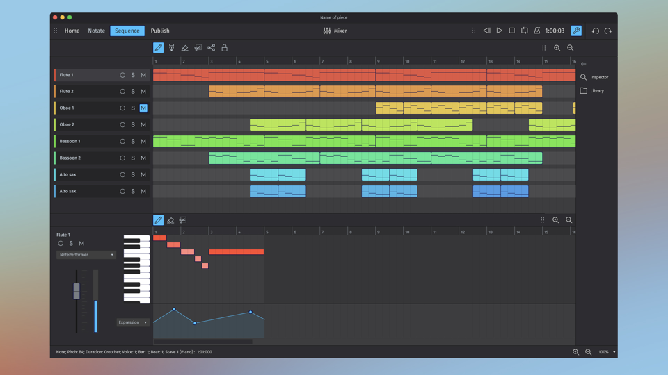
My favourite example of this is Sibelius. The 'Quit Sibelius' button is precisely where you'd expect to find the 'Next' button.This video shows it at 6:33 https://m.youtube.com/watch?v=dKx1wnXClcI&t=6m33s
⬐ apexalphaThat was hilarious, thank you.⬐ aasasdThat dude also among other programs reviewed MuseScore, and now he's a head designer at MuseScore.⬐ frosted-flakesHe's actually the Product Owner now (I think that's what it was), which I'm assuming is a promotion.
For those out of the loop:Tantacrul is a composer who put together some hilariously scathing UI/UX video reviews for some popular composing software tools out there, including MuseScore [1] [2] [3]. The team developing MuseScore then brought him on as head of design.
[1] Sibelius: https://www.youtube.com/watch?v=dKx1wnXClcI
[2] MuseScore: https://www.youtube.com/watch?v=4hZxo96x48A
[3] Dorico: https://www.youtube.com/watch?v=S-3wEC6Fj_8
⬐ coldcodeSometimes the harshest (but expert) critics do make things better. In my first startup/application in the 80's our harshest beta tester turned into a big supporter because he was passionate about us getting it right.⬐ Finnucane⬐ kangaliooYeah, he didn't just say, this sucks, but went into some detail about why things didn't work as well as they could and how they could be made better. The develpers were smart enough to realize that this was really high-value feedback.Yeah, in making the MuseScore review video, Tantacrul got in communication with the developers. He talked with them about the issues he had found, and they proceeded to fix some of them super quickly and shipped it in a new release iirc. I guess Tantacrul was really impressed and positive about the project, so he decided to continue working with them⬐ TylerE...and then he went and did a video on Dorico, which the next version of MuseScore blatantly rips off.⬐ sjwrightThat is a rather incendiary claim to make with no evidence. Can you provide some context for this assertion?⬐ TylerEhttps://www.steinberg.net/forums/viewtopic.php?t=191373Compare that "mockup" with the same screen I just took in Dorico
https://musescore.org/sites/musescore.org/files/2020-06/Stra...
https://i.imgur.com/3qKBAGml.png
And that's hardly the only example from the "all new" MuseScore 4.
⬐ sjwrightYour imgur link isn't working. But looking at those MuseScore 4 shots and comparing them to what I see from the Steinberg website, what I see is mostly superficial aesthetics which are on trend all over—not just notation apps.Certainly no more blatant than the continual tit-for-tat "ripping off" between iOS and Android.
⬐ sjwrightI tried your imgur link again and it worked this time. What I’m seeing here is a couple of similar arbitrary locations for UI elements, similar use of colour, similar flat design popularised by Microsoft and many elements that are common among most if not all modern sequencers.I get the frustration that arises from a competitor having a similar aesthetic but I’ve used software long enough to know that what makes software great is the details, the nuances, and everything else which distinguishes a program from a Winamp skin.
The cheese melts in the microwave; the music melts in Sibelius.Tantacrul’s review of Sibelius’ might be the most entertaining serious critique of a software user interface ever posted to YouTube.
> That's plausible but AVID Pro Tools is even more prestigious than Logic and AVID's market cap is only $250 million[0].In no universe is Pro Tools more prestigious than any of its competition.
I think Pro Tools is viewed as The Thing That All Studio PHB Managers Purchased At Some Point So It's Reasonable For Studio Techs to Be Trained For. Kind of the "nobody ever got fired for picking IBM" of the music industry. In my opinion, AVID does not have a reputation for making innovative products. See what happened when they acquired Sibelius (https://www.youtube.com/watch?v=dKx1wnXClcI).
My limited experience with the industry suggests that Ableton, Bitwig, and Logic are the Cool Tools for Producing Music, that Cubase (Steinberg) is particularly popular with composers, that FL Studio is the cool low-cost leader among students, and that Reason is The Outsider. Notice which software is not in this list.
⬐ matheusmoreira> My limited experience with the industry suggests that Ableton, Bitwig, and Logic are the Cool Tools for Producing Music, that Cubase (Steinberg) is particularly popular with composers, that FL Studio is the cool low-cost leader among students, and that Reason is The Outsider. Notice which software is not in this list.I wonder where a modern tracker such as Renoise fits in. This one even works on Linux.
⬐ rorykoehlerPro Tools is seen as the serious tool while the other DAWs you mention are toys for electronic music producers⬐ jdietrich⬐ kitotikPro Tools has brand recognition amongst non audio engineers and inertia of older engineers who can't be bothered to switch, but no-one actually likes it. Nuendo, Sequoia and SADiE are the Serious Professional options, while Reaper enjoys a growing cult following.⬐ rorykoehler⬐ renaudgI like it. All the other stuff makes the music for me. I feel way more in control on Pro Tools. I make what's in my head and not what the software funnels me into.20 years ago maybe.I don't know if you've noticed, but there's hardly any music that isn't electronic these days.
⬐ monadic2⬐ qppo> I don't know if you've noticed, but there's hardly any music that isn't electronic these days.That's true, but you can hardly say the same thing about synths, which seems to be the salient detail.
They're different product categories entirely these days. The other DAWs aren't "toys" and in fact do a lot of things significantly better than Pro Tools.Pro Tools as a product only makes sense at scale, with multiple people in the workflow in different locations. Same story for Media Composer compared to other NLEs.
⬐ rorykoehlerI know they aren't "toys" but when I tell the Ableton crowd I use Pro Tools the common response is what one of respect for using more professional tools. I know it's mostly perception at this stage however this is from people who've been releasing music and touring with large crowds.There’s also the legacy of pro tools and logic.For many years pro tools was the only game in town for serious non-linear audio editing, and did not support midi at all.
Around the same time period Logic was the only game in town for serious midi work and didn’t support audio at all.
The solution isn't to put things in preference windows either because even smart users will find that cumbersome. There's an interesting pair of videos (if you have some time) that goes over the UI of two competing music scoring software and why one is bad and the other good.
⬐ reacwebA video to teach me about UI ! It is well known that text is a lot more effective than watching video.⬐ wirrbelinteresting, of course partially subjective.I switched to lilypond for typesetting music, I guess it may not be the right option for those who actually compose (I mostly typeset classical pieces to add fingering and obtain a better quality than the cheaply layouted scores that are published today have, unfortunately guitar sheet music is way behind the standards that are set in classical piano music, and just retyping things in lilypond improves the quality by A LOT).
This entertaining diatribe about Sibelius' difficult to use design mentions poor use of a Ribbon. https://www.youtube.com/watch?v=dKx1wnXClcI
⬐ maxxxxxThis is great. Makes me think of the change from Visual Studio from 2008 to 2010. They made a very good IDE into a slow, unreadable mess with much less functionality just to have a “flat” interface. I still don’t understand that nobody at MS noticed how bad that change was. Or more likely people weren’t listened to. Even after almost 10 years they barely have caught up to what they had with 2008.⬐ int_19hIt was a major rewrite of large chunks of the interface from native C++ using raw Win32 calls (and said C++ was written back in 1996 in many cases, to the point where it'd do AddRef/Release calls by hand sometimes - forget RAII and anything that you know of modern C++), to C# and WPF. And it was necessary even solely from an engineering perspective, because adding features to that original code was becoming a huge pain.⬐ maxxxxxThe result was worse in pretty much every way. Graphically (whole idea was it to take out all colors from the Ui? I don't know anyone who thought the 2010 UI was a good idea), Slower, less customizable , less features (for example they removed macro recording).It was definitely not a good showcase for WPF.
⬐ int_19hThese are different issues, though.For example, the color was a UX design decision - WPF made it possible to do theming easier, but even so, doing it instead of using stock controls actually required extra effort. But, speaking of colors and preferences - when VS 2012 went with its "black and white" color theme a couple years later, a lot of people actually demanded specifically the return of the blue VS2010 theme. Which is why it's still there today.
As for macros, it was essentially on life support for several releases prior to all that. It was essentially a separate subproduct, coming from Office originally (since it also uses VBA for scripting), but forked ages ago, and not well maintained... and it was completely broken by changing the GUI framework. So the choice was basically to rewrite or drop it at that point, and a rewrite would require substantial work - on par with the rest of the product, really. And with <1% of VS users using macros at all, it was very hard to justify a rewrite.
I would agree, though, that WPF was not a stellar framework at the time. But, ironically, VS adopting it made it better in so many ways - for example, WPF font rendering was fixed (to be less blurry) largely because of user feedback in VS2010. Perf was improved substantially, as well.